Observability is a necessity for modern distributed applications. As systems grow complex, having a clear picture of what’s happening under the hood becomes crucial for keeping everything running smoothly. Having said that, if you’re an SRE or a DevOps engineer, you’ll agree that it’s not easy to achieve meaningful observability.
You’re often drowning in metrics from applications and systems, which often floor your monitoring tools. The challenge lies not only in collecting these metrics but also in making sense of them. Visualizing them is another hurdle. Should you use a line chart, bar graph, or pie chart? These decisions are not always straightforward, and a wrong choice can lead to missed insights.
In this blog post, I’ll show you how you can use Clio to analyze your metrics intelligently and generate Grafana dashboards.
Overload of Metrics & The Visualization Dilemma
One thing that all of you working in production setups would agree with is the sheer volume of metrics generated by systems, which can be overwhelming. You have metrics flowing in from your application, infrastructure, database, and services, creating a flood of metrics that are not easy to manage. This leads to a few challenges:
- Too many metrics yet insufficient insight: With so much data from metrics, it becomes difficult to identify what’s important. Key signals can get lost in the noise, making detecting anomalies hard. Furthermore, metrics from different sources lead to fragmented observability, which causes inconsistency.
- Choosing the right visualization isn’t straightforward: With options like line graphs, bar charts, scatter plots, and more, knowing which one accurately represents the data is tricky. Some charts may look appealing, but these can introduce ambiguity or even mislead users.
Manually building dashboards requires deep domain expertise and regular updates to stay relevant. Engineers spend significant time tweaking dashboard configurations, which results in lost productivity. The combination of metric overload and visualization complexity makes implementing observability cumbersome.
How AI Can Solve Metrics and Visualization Problems
That’s where you can leverage AI to transform how you approach observability by automating metrics analysis and dashboard building. It can tackle both the issues of analyzing metrics and building dashboards that we discussed in the previous section.
- Using AI, it’s possible to analyze many metrics, identify patterns, and separate relevant data from noise. Unlike manual practices, AI is dynamic and can adjust its analysis to be relevant.
- Building dashboards manually is time-consuming and prone to errors. It requires the person building the dashboard to decide what metrics to display, how to arrange them, and what visualization to show. AI can automate this process by analyzing the metrics and generating dashboards.
Using Clio For Generating Grafana Dashboards
Clio is an AI-powered copilot that assists with DevOps-related tasks using command-line interface (CLI) agents. It leverages OpenAI’s capabilities to provide intelligent, context-aware assistance directly from your terminal, making managing complex workflows and different cloud environments easier.
You can get started with Clio by running brew install gptscript-ai/tap/clio to install it, and you can use your own OpenAI API Key or your GitHub account if you don’t have an API key.
Use Case
For this use case, we’ll deploy an Nginx application on a GKE cluster. On that, we’ll configure the Nginx exporter, cAdvistor, and Node Exporter plugins, which will generate metrics. We’ll then configure Prometheus and Grafana. Lastly, we’ll ask Clio to analyze the metrics generated and create a Grafana dashboard for us.
Setting Up GKE Cluster & Deploying Nginx
I asked Clio to set up a GKE cluster. Below is the output of successful cluster creation.
Running gcloud container clusters create gptscript-olly - -zone us-centrall-a - -num-nodes 3 - -machine-type n1-standard- 1
Default change: VPC-native is the default mode during cluster creation for versions greater than 1.21.0-gke. 1500. To create advanced routes based Note: The Kubelet readonly port (10255) is now deprecated. Please update your workloads to use the recommended alternatives.

Note: Your Pod address range (
- -cluster-ipv4-cidr') can accommodate at most 1008 node(s) .
Creating cluster gptscript-olly in us-centrall-a
—--------------------------------------------------------------
Created [https://container.googleapis.com/vl/projects/omni-new/zones/us-centrall-a/clusters/gptscript-olly]
To inspect the contents of your cluster, go to: https: //console.cloud.google.com/kubernetes/workload /gcloud/us-centrall-a/gptscript-olly?project= kubeconfig entry generated for gptscript-olly.

The new cluster named gptscript-olly has been successfully created with standard compute resources. Here are the details:
• Cluster Name: gptscript-o11y
Location: us-centrall-a
• Master Version: 1.30.5-gke. 1014001
• Master IP: 34.69.101.132
• Machine Type: n1-standard -1
• Node Version: 1.30.5-gke. 1014001
• Number of Nodes: 3
• Status: RUNNING
You can inspect the contents of your cluster by visiting the Google Cloud Console
https://console.cloud.google.com/kubernetes/workload /gcloud/us-centrall-a/gptscript-o11y?project=omni-new.

If you need any further assistance or actions on this cluster, feel free to let me know!
Configuring Metrics
Once the Nginx application is deployed, I asked it to configure metrics on it to collect metrics from Nginx instance.
> can you configure this application to collect some metrics related to requests, latency etc?

To collect metrics related to requests, latency, and other performance indicators for the Nginx application, we can use the Nginx Exporter.
This exporter will expose Nginx metrics in a format that Prometheus can scrape.

### Steps to Configure Nginx for Metrics
1. Install Nginx Exporter: Deploy the Nginx Exporter as a sidecar container alongside your Nginx application.
2. Configure Nginx: Update the Nginx configuration to enable the status module, which the exporter will use to gather metrics.
3. Update Prometheus Configuration: Add the Nginx Exporter as a scrape target in Prometheus.

Let's start by deploying the Nginx Exporter and updating the Nginx configuration. I'll create a configuration for the Nginx Exporter.
Call Arguments:
write {"filename": "nginx-exporter-deployment yam", "content": "apiVersion: apps/v1nkind: Deployment nmetadata: n name: nginx-exp... (605)

Writing nginx-exporter-deployment.yaml
Wrote (641) bytes to file nginx-exporter-deployment.yaml

Call Arguments:
exec {"command": "kubectl apply -f nginx-exporter-deployment.yaml"}
Writing nginx-configmap.yaml
If you observe, it knew that Prometheus will be required to scrape all the metrics and push them to Grafana, so it automatically configured Prometheus with all the necessary configuration.
Once this was done, I asked it to configure cAdvisor and Node Exporter plugins as well.
Running kubectl apply -f cadvisor-daemonset.yaml
daemonset.apps/cadvisor configured

The Advisor DaemonSet configuration has been updated and applied. Let's verify if the cAdvisor pods are now running correctly. I'll check the status of the cAdvisor pods again

Call Arguments:
exec {"command": "kubectl get pods - l app=cadvisor"}
Running kubectl get pods - 1 app=cadvisor
NAME READY STATUS RESTARTS AGE
cadvisor-2qjw6 1/1 Running 0 5s
Cadvisor-7c5f5 1/1 Running 0 5s
cadvisor-j22zx 1/1 Running 0 5s
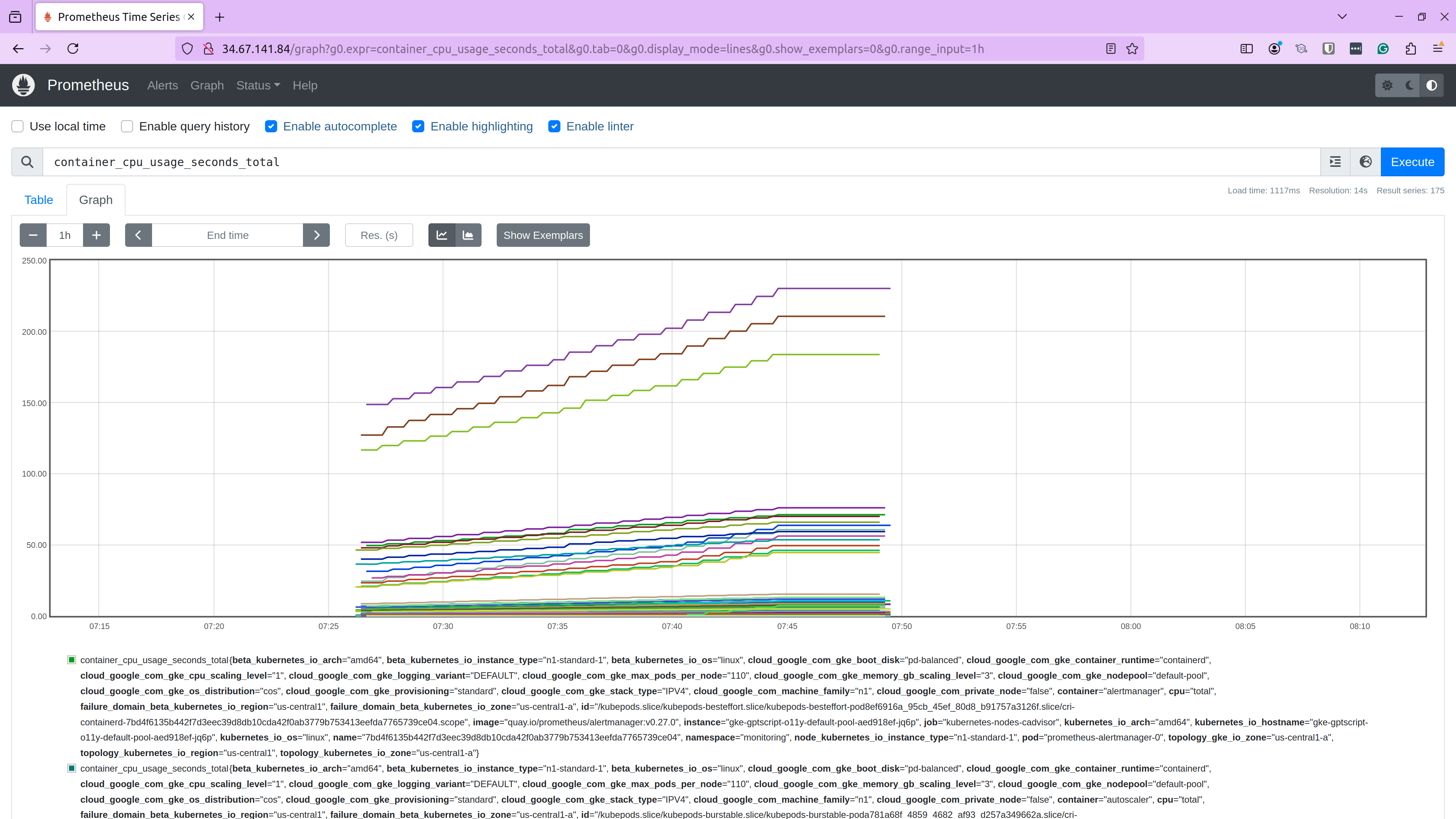
After these metrics were configured, I verified them at Prometheus end-point and I was able to view these metrics correctly.
Installing & Configuring Grafana
Once I got the metrics into Prometheus, the next step was to deploy and configure Grafana.
> Install grafana on the cluster and give me the public url to access it. Give me the credentials to access the instance and also tell me the prometheus URL to be configured as data source in Grafana to get the current metrics in Prometheus to Grafana.

To install Grafana on your cluster and provide a public URL for access, we'll follow these steps:
1. Deploy Grafana: Use Helm to deploy Grafana on your cluster.
2. Expose Grafana Publicly: Create a LoadBalancer service to expose Grafana with an external IP.
3. Provide Access Credentials: Retrieve the default credentials for accessing Grafana.
4. Configure Prometheus as a Data Source: Provide the Prometheus URL to be used as a data source in Grafana.

Let's start by deploying Grafana using Helm. I'll proceed with the installation.

Call Arguments:
exec {"command"; "helm repo add grafana https: //grafana.github.io/helm-charts && helm repo update && helm install grafana grafana... (52)
Running helm repo add grafana https: //grafana.github.io/helm-charts && helm repo update && helm install grafana grafana/grafana - -namespace monitoring - - create-namespace
After it was installed, I asked it to configure the service and give me the credentials to access the Grafana instance.
Running kubectl get svc grafana-external -n monitoring -o jsonpath='{.status. loadBalancer.ingress [0].ip}'

The LoadBalancer service for Grafana has been created. It may take a few moments for the external IP to be assigned. Let's check the status again to see if the IP is available.

Call Arguments:
exec {"command": "kubectl get svc grafana-external -n monitoring"}
Running kubectl get svc grafana-external -n monitoring

NAME TYPE CLUSTER- IP EXTERNAL - IP PORT (S) AGE
Grafana-external LoadBalancer 34.118.236.23 34.123.209.108 80:30800/TCP 41s

Grafana is now exposed with the external IP address: 34.123.209.108. You can access the Grafana UI by navigating to http: //34.123.209.108 in vour web browser.

### Access Credentials
• Username: admin
• Password: You can retrieve the password using the following command:
kubectl get secret - -namespace monitoring grafana -o jsonpath="{ data.admin-password'" | base64 - - decode ; echo

### Prometheus URL for Grafana
To configure Prometheus as a data source in Grafana, use the following URL:
• Prometheus URL: http://34.67.141.84 the external IP of the Prometheus service)
If you need any further assistance or have questions, feel free to ask!
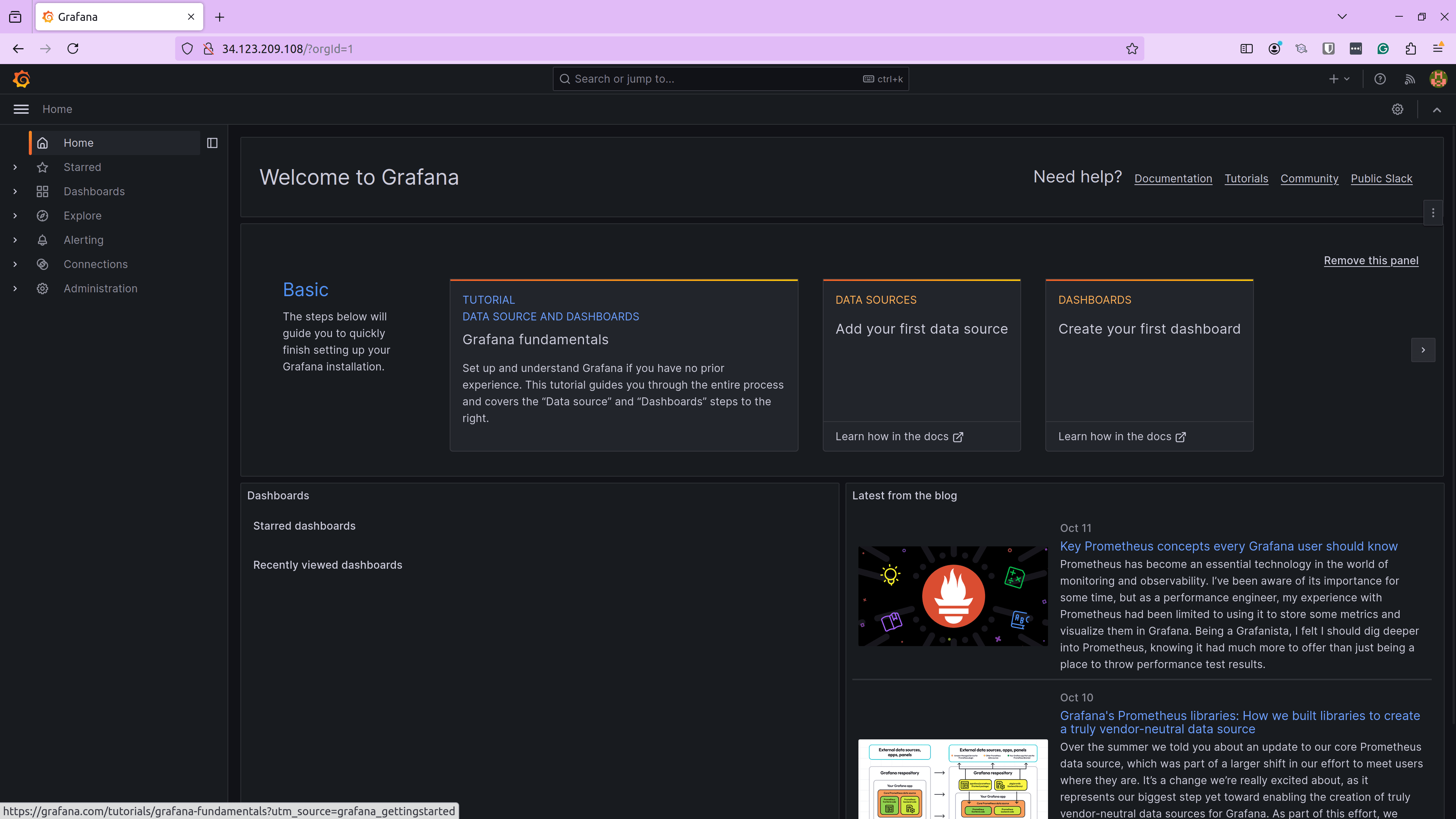
With these details, I was able to access the Grafana instance.
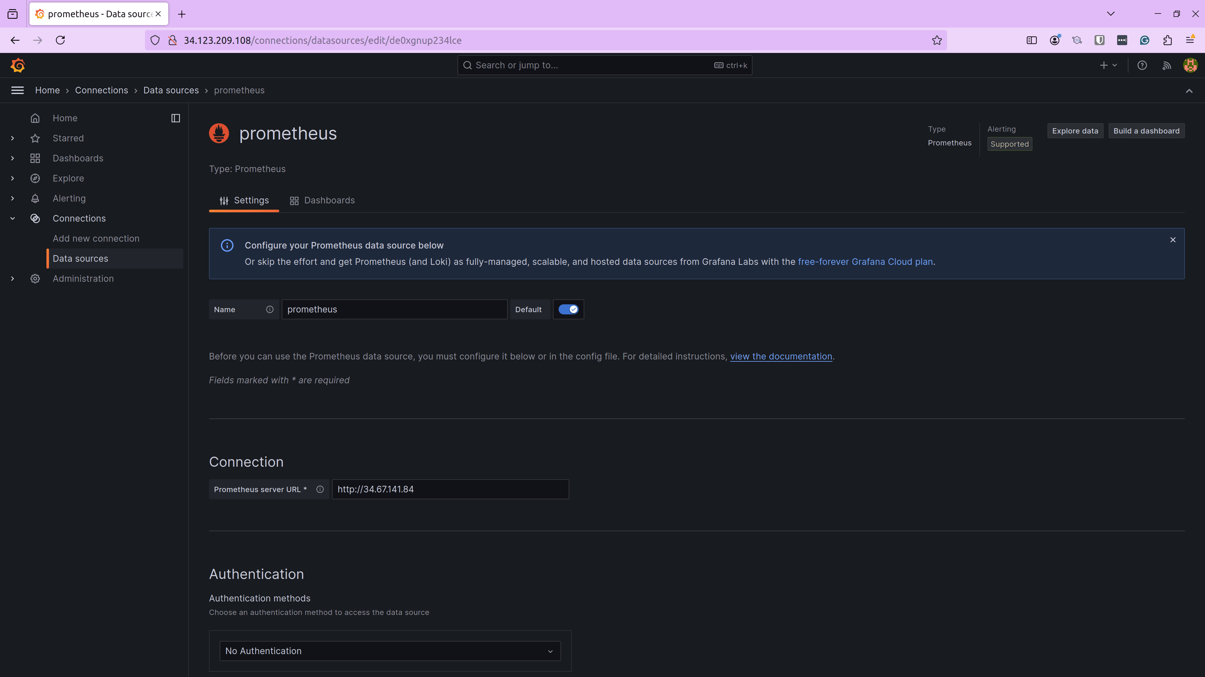
The next step was configuring the data source in Grafana. Clio provided us with the Prometheus URL that we used to configure as a data source.
At this point, Grafana was able to talk to Prometheus successfully. The next and final step was to ask Clio to analyze the metrics generated by various plugins we installed and, based on the analysis, create a Grafana dashboard.
Generating Grafana Dashboard
For the unaware, Grafana dashboards are in .json format, which has the details of all the metrics, visualizations, and panels. So, we’ll ask Grafana to generate the json dashboard file for us.
> Now, I want you to analyse all the metrics that is scapped by Prometheus which includes, nginx exporter, advisor and node exporter metrics and give me a grafana dashboard son code with various panels associated with different metrics that you think are necessary to be tracked. Group related metrics together and use appropriate types of panels - gauges, text, histograms etc. - based on your analysis of the metrics.

To create a comprehensive Grafana dashboard for the metrics scraped by Prometheus, we will focus on the following key areas:
1. Nginx Exporter Metrics: Track request rates, response times, and error rates.
2. Advisor Metrics: Monitor container resource usage, such as CPU and memory.
3. Node Exporter Metrics: Observe node- level metrics like CPU, memory, and disk usage.

### Dashboard Structure
Nginx Metrics:
• Request Rate: Line graph showing requests per second.
• Response Time: Histogram of response times.
• Error Rate: Gauge for error rates.
Advisor Metrics:
• Container CPU Usage: Line graph for CPU usage per container.
• Container Memory Usage: Gauge for memory usage per container.
• Container Network Traffic: Line graph for network traffic.
Node Exporter Metrics:
• Node CPU Usage: Line graph for CPU usage per node.
• Node Memory Usage: Gauge for memory usage per node.
• Disk Usage: Bar chart for disk usage.

I'll create a JSON configuration for a Grafana dashboard with these panels. Let's proceed with generating the JSON code.
If we closely look at the above output. It knew all the plugins we had installed for metrics, so it listed Nginx Exporter, cAdvisor metrics, and Node Exporter. It automatically created the Dashboard structure, and it automatically segregated them based on the metrics plugins. Then, it chose the most relevant metrics and the preferred visualization type. For example, it chose Response Time from Nginx Metrics and configured it as a line graph.
Below is the dashboard.json file generated by Clio.
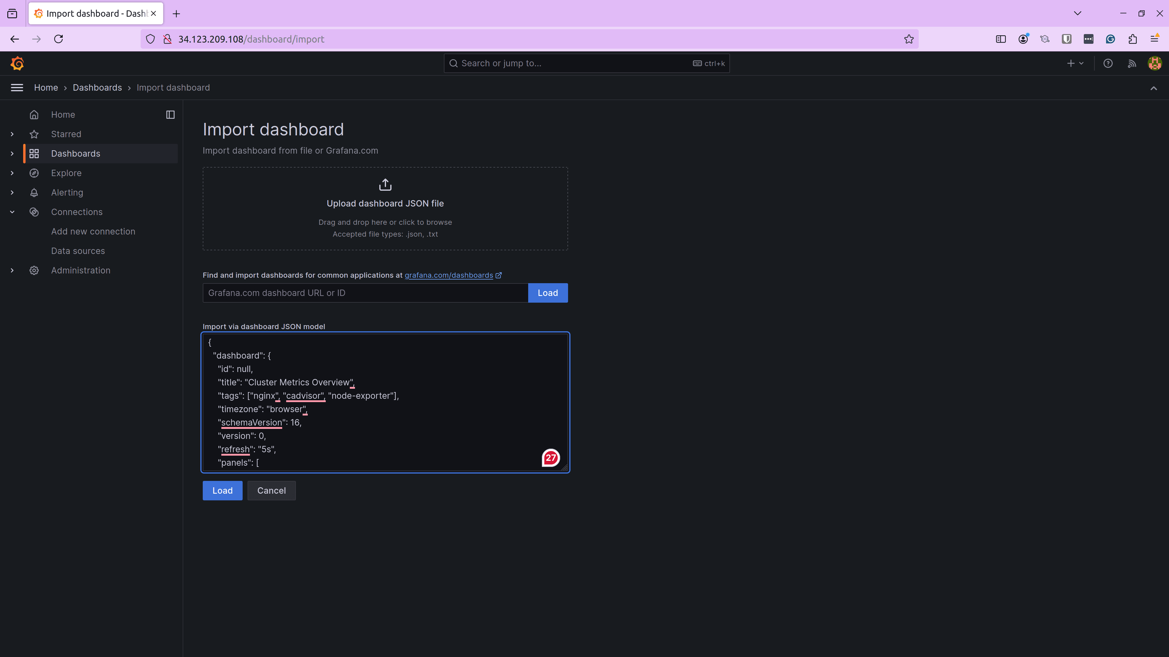
{
 "id": null,
 "title": "Cluster Metrics Overview",
 "tags": ["nginx", "cadvisor", "node-exporter"],
 "timezone": "browser",
 "schemaVersion": 16,
 "version": 0,
 "refresh": "5s",
 "panels": [
   {
     "type": "timeseries",
     "title": "Nginx Request Rate",
     "targets": [
       {
         "expr": "rate(nginx_http_requests_total[1m])",
         "legendFormat": "{{server}}",
         "refId": "A"
       }
     ],
     "gridPos": {"x": 0, "y": 0, "w": 12, "h": 8},
     "fieldConfig": {
       "defaults": {
         "unit": "req/s"
       }
     }
   },
   {
     "type": "timeseries",
     "title": "Nginx Request Count",
     "targets": [
       {
         "expr": "nginx_http_requests_total",
         "legendFormat": "{{server}}",
         "refId": "B"
       }
     ],
     "gridPos": {"x": 12, "y": 0, "w": 12, "h": 8},
     "fieldConfig": {
       "defaults": {
         "unit": "none"
       }
     }
   },
   {
     "type": "gauge",
     "title": "Nginx Error Rate",
     "targets": [
       {
         "expr": "sum(rate(nginx_http_requests_total{status=~"5.."}[1m])) / sum(rate(nginx_http_requests_total[1m]))",
         "refId": "C"
       }
     ],
     "gridPos": {"x": 0, "y": 8, "w": 6, "h": 4},
     "fieldConfig": {
       "defaults": {
         "unit": "percent"
       }
     }
   },
   {
     "type": "timeseries",
     "title": "Container CPU Usage",
     "targets": [
       {
         "expr": "rate(container_cpu_usage_seconds_total[1m])",
         "legendFormat": "{{container}}",
         "refId": "D"
       }
     ],
     "gridPos": {"x": 6, "y": 8, "w": 12, "h": 8},
     "fieldConfig": {
       "defaults": {
         "unit": "percent"
       }
     }
   },
   {
     "type": "gauge",
     "title": "Container Memory Usage",
     "targets": [
       {
         "expr": "container_memory_usage_bytes",
         "legendFormat": "{{container}}",
         "refId": "E"
       }
     ],
     "gridPos": {"x": 18, "y": 8, "w": 6, "h": 4},
     "fieldConfig": {
       "defaults": {
         "unit": "bytes"
       }
     }
   },
   {
     "type": "timeseries",
     "title": "Container Network Traffic",
     "targets": [
       {
         "expr": "rate(container_network_receive_bytes_total[1m])",
         "legendFormat": "{{container}} receive",
         "refId": "F"
       },
       {
         "expr": "rate(container_network_transmit_bytes_total[1m])",
         "legendFormat": "{{container}} transmit",
         "refId": "G"
       }
     ],
     "gridPos": {"x": 0, "y": 16, "w": 12, "h": 8},
     "fieldConfig": {
       "defaults": {
         "unit": "Bps"
       }
     }
   },
   {
     "type": "timeseries",
     "title": "Node CPU Usage",
     "targets": [
       {
         "expr": "rate(node_cpu_seconds_total{mode="idle"}[1m])",
         "legendFormat": "{{instance}}",
         "refId": "H"
       }
     ],
     "gridPos": {"x": 12, "y": 16, "w": 12, "h": 8},
     "fieldConfig": {
       "defaults": {
         "unit": "percent"
       }
     }
   },
   {
     "type": "gauge",
     "title": "Node Memory Usage",
     "targets": [
       {
         "expr": "node_memory_MemAvailable_bytes / node_memory_MemTotal_bytes",
         "legendFormat": "{{instance}}",
         "refId": "I"
       }
     ],
     "gridPos": {"x": 0, "y": 24, "w": 6, "h": 4},
     "fieldConfig": {
       "defaults": {
         "unit": "percent"
       }
     }
   },
   {
     "type": "barchart",
     "title": "Disk Usage",
     "targets": [
       {
         "expr": "node_filesystem_size_bytes - node_filesystem_free_bytes",
         "legendFormat": "{{instance}} {{mountpoint}}",
         "refId": "J"
       }
     ],
     "gridPos": {"x": 6, "y": 24, "w": 12, "h": 8},
     "fieldConfig": {
       "defaults": {
         "unit": "bytes"
       }
     }
   }
 ]
}
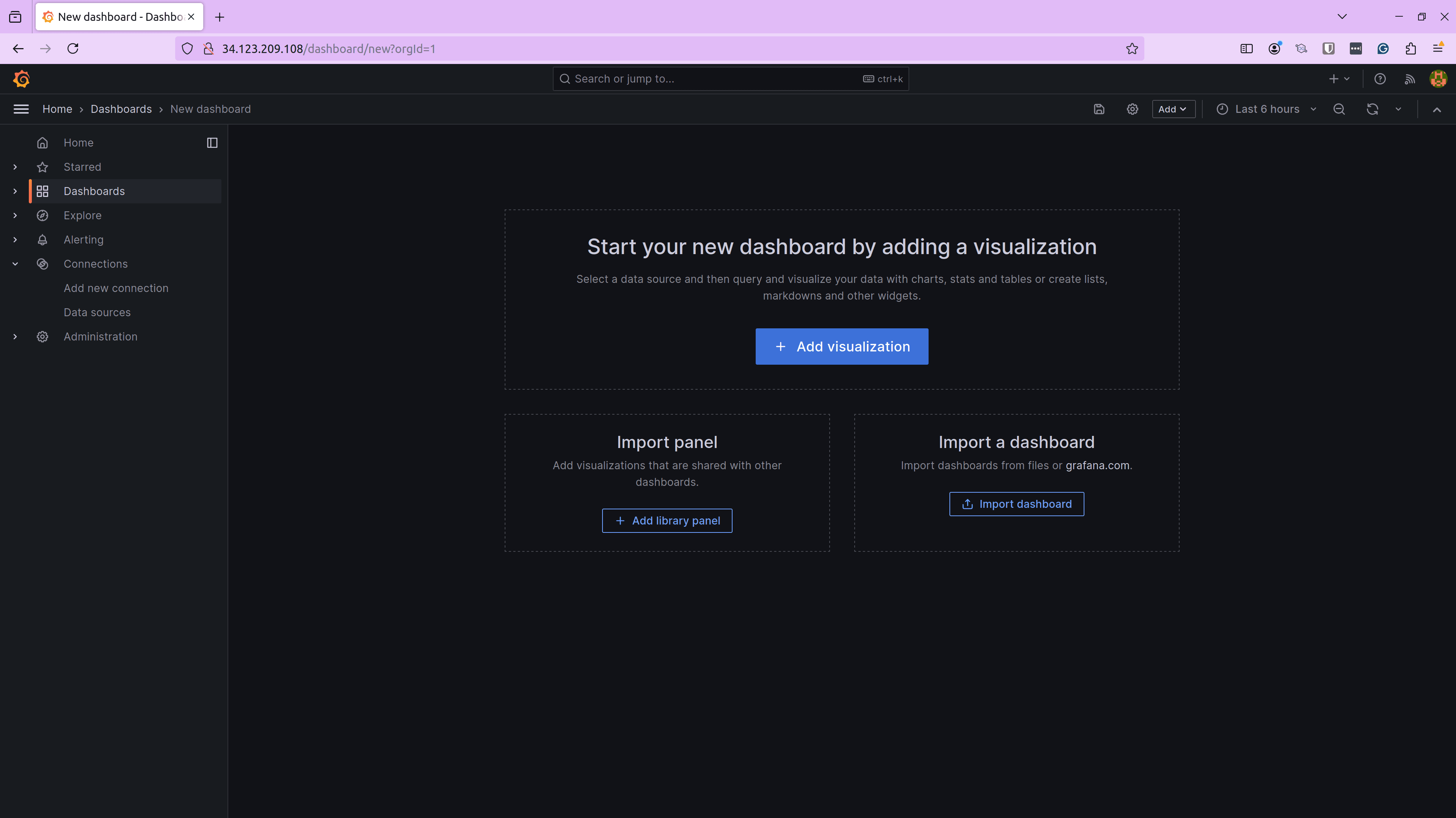
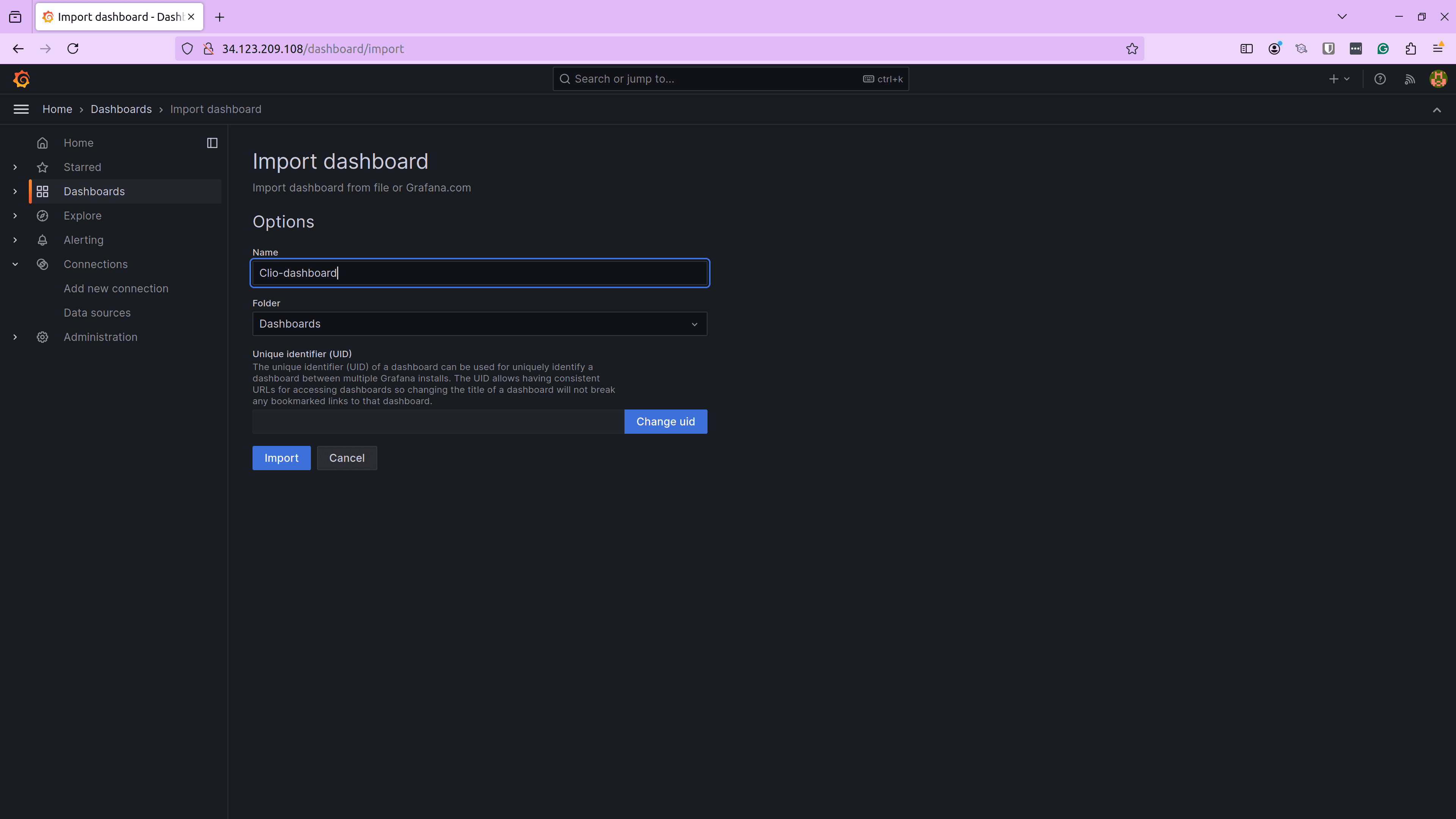
Next, we import this dashboard in Grafana by uploading the dashboard.json file and providing a name for our dashboard.
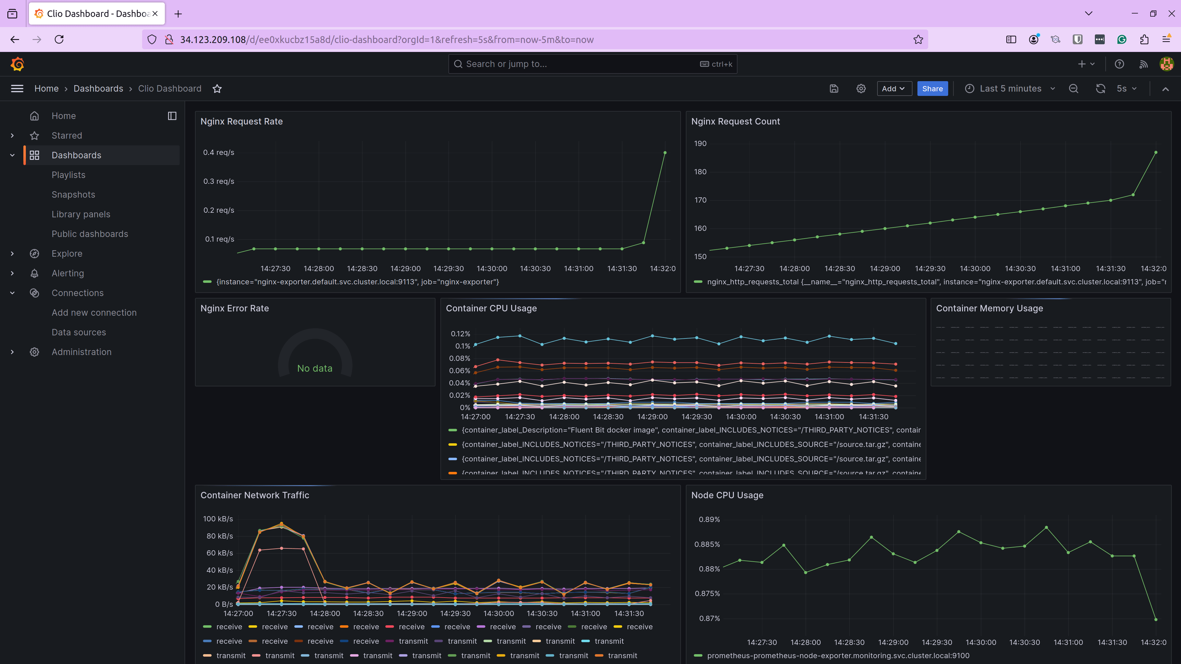
With this, our dashboard is created successfully. Let us go ahead and access the dashboard.
As you see, we had a fully functional dashboard in place without needing to go through the metrics, and create panels and visualizations. I created a small script to generate some requests for the Nginx application so that we can see some metrics here. Since there weren’t any errors, the Nginx Error Rate gauge displayed No Data.
Similarly, you can tweak your prompts and metrics and ask Clio to analyze complex metrics, find interesting insights, and create Grafana dashboards for you.
Conclusion
If you’ve manually created Grafana dashboards, you would know this task easily takes a few hours to get the right scale, type of graph, and a good look at the overall dashboard. But we saw how Clio was able to not only configure my infrastructure, deploy the application, and configure and analyze metrics but also easily create a Grafana dashboard with the relevant metrics, scale, and visualization.
This is just one of Clio’s use cases. You can use Clio to perform different types of DevOps-related tasks in many other ways. Try Clio and check out our Tutorials to learn more about the various things you can do using Clio.
For the latest updates on Clio, follow @Clio_ai on X.
